Basic idea
Although I’m not sure how useful 3D transformations are in modern web design and how extensively you should use them, there is no doubt that they are just cool. Therefore I want to show you how to create a simple 3D cube using some simple HTML divs and CSS3 3D transforms.
The basic idea is to create all the sides of our cube in the well known 2D space using divs (each having a different color) and then transform each side of the cube into the 3D space. Meaning changing the position and rotating the div so that it will be in the right place for a cube. We will start off with a single div and then continue to add the other sides of the cube.
This is what we want to achieve:
First 3D tranfrom
First of all we need some place to draw our cube. Imagine this as a canvas supporting 3D content. We can use a simple div as our canvas and add it some CSS properties to achieve this. Look at the example below as our starting point.
Lets add some properties to the canvas.
.canvas {
  transform-style: preserve-3d;
  -webkit-transform-style: preserve-3d;
  -webkit-perspective: 500px;
  perspective: 500px;
  width:250px;
  height:250px;
  background-color:black;
}
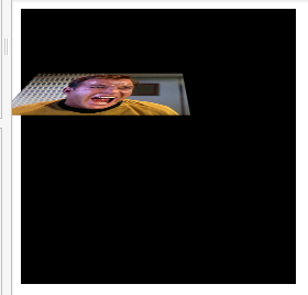
And now lets transform the blue box in the 3D space by rotating it along the x-axis.
.side {
  background-color:blue;
  width:150px;
  height:150px;
  -webkit-transform: rotateX(45deg);
  transform: rotateX(45deg);
}
Here is the example:
You can easily enhance the example by adding some image to the background of the rotated plane and experiment with different degrees.
So what did we just do?
-webkit-perspective: 500px;
perspective: 500px;
The perspective property kind of activates our 3D space. The value defines the distance from the viewer. In our case 500px is a pretty good value. If the value is low, the 3D effect looks weird, if the value is much higher the 3D effect is not notable anymore. Here are some examples to get a feeling about the perspective:

transform-style: preserve-3d;
-webkit-transform-style: preserve-3d;
The transform style property can take either flat or preserve-3d. preserve-3d allows the child elements to be in the 3D space. I found this example to be helpful.
  -webkit-transform: rotateX(45deg);
  transform: rotateX(45deg);
The transform property does the actual transformation of the div. In the example it is rotated by 45 degrees along the x-axis.
The 3D coordinate system
We need some basic understanding about the 3D coordinate system to be able to position and transform each side of the cube. See below examples of some basic tranforms.
rotateX
rotateY
rotateZ
translateZ
Back to the cube
If we combine the rotate and translate transforms, we can easily build up a cube. Let’s start with the 6 faces of the cube. Our goal ist to create a cube with a dimension 100px*100px*100px.
Now we just need to rotate and translate the different faces and we have a 3D cube. At first, all our faces are in the center of the cube. From the center:
- The back side needs to be rotated by 180° around the X axis and then moved by 50px
- The front side doesn’t need any rotation but needs to be moved by 50px
- The top side needs to be rotated by 90° around the X axis and moved by 50px
- The bottom side needs to be rotated by -90° around the X axis and moved by 50px
- The left side needs to be rotated by -90° around the Y axis and moved by 50px
- The right side needs to be rotated by 90° around the Y axis and moved by 50px
Note: to stack all sides of the cube I needed to add position:absolute. Without that we would also transform our sides, but not from the same center. You can try to remove position:absolute to see what happens.
Add some animation
Now lets add some keyframe animation to rotate the cube along its Y axis. For this first we need to add another div between the canvas and the 6 sides of the cube. Lets call this div cube. Having this element, we can rotate the whole cube at once.
