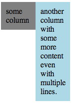
I can’t remember how often I had to create a column based layout using HTML and always struggled when it came down to placing two divs next to each other having the same size. Usually the problems pops up when the columns have a different background or some kind of other visual attribute such as a border. Because when everything has the same color who can tell you if the elements have the same size? 😉

There are different approaches to solve this issue and none of them I really liked until I learned about display:table-row and display-table-cell. Both display values are fully supported by all modern browsers (starting from IE9).

With those display values you can arrange your divs like a table without having to use the old school <table> for laying out your page.
The usage of this CSS properties is pretty simple and straight forward. Imagine we want to create a row with two columns. Back in the old days one would have coded something like:
<table>
  <tr>
    <td>column1</td>
    <td>column2</td>
  </tr>
</table>
The CSS property display allows you to style a visual element to behave like table elements. Instead of using <table>, <tr> and <td> elements we just use simple divs. See the example in the jsFiddle below: